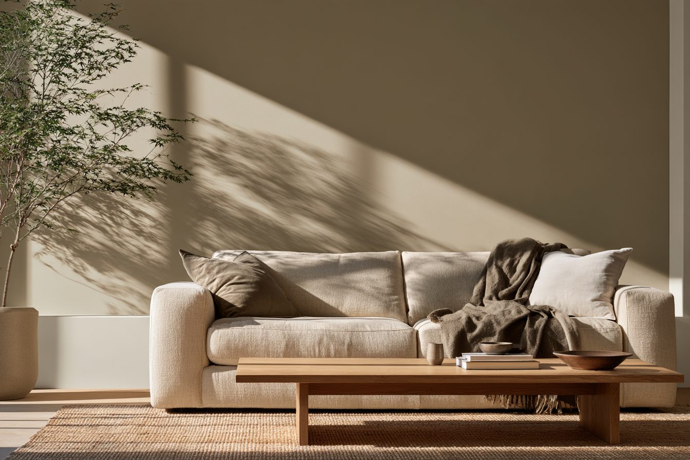
Accessible Beige is one of the most popular neutrals Sherwin-Williams sells, and almost every review calls it a warm greige that turns gray in some rooms. That is true, but it is also vague. How warm is warm, and how much lighter is it than the colors you are comparing it with?
So this guide puts numbers on it. I pulled the published data for Accessible Beige and five neighbors from Sherwin-Williams, compared how far each one leans warm, and turned it into a simple check for your room.
Short answer: Accessible Beige (SW 7036) has an LRV of 57.67, which Sherwin-Williams rounds to 58, so it is a mid-light neutral, not a pale one. Its published RGB is 209, 199, 184: red sits 25 points above blue, which makes it warmer than Agreeable Gray (gap 16) and Repose Gray (gap 12), and lighter and cooler than Balanced Beige (LRV 45.6, gap 30). In north light it leans greige rather than beige. For trim, Sherwin-Williams pairs it with Aesthetic White (LRV 73); Alabaster (82) or Pure White (84) give crisper contrast.
Disclosure: this post contains affiliate links, and as an Amazon Associate I earn from qualifying purchases. If you buy through them I may earn a small commission at no extra cost to you. I only recommend things I would use in my own home.
Accessible Beige by the Numbers
Paint chips are printed, screens are backlit and every room is lit differently, so the published numbers are the only fixed point. Here is what Sherwin-Williams lists for SW 7036 in its color data.
| Spec | Accessible Beige SW 7036 | What it tells you |
|---|---|---|
| LRV | 57.67 (shown as 58) | Reflects a bit over half the light that hits it: mid-light |
| Hex | #D1C7B8 | Use it for a digital mood board, not to judge the real paint |
| RGB | 209, 199, 184 | Red above green above blue: a warm neutral |
| Color family | Neutral | Filed under neutrals, next to greiges and beiges |
| Coordinating colors | Aesthetic White SW 7035, Sanderling SW 7513, Cadet SW 9143 | Sherwin-Williams’ own pairings for trim and accents |
Values from the Sherwin-Williams color data for SW 7036, checked November 14, 2026. LRV is light reflectance value on a 0 to 100 scale.
The LRV is the number most people skip. At about 58 it sits right in the middle of the light range, so Accessible Beige will look a step deeper on your wall than on a small chip held up to a window. If you want a pale, airy wall, look in the 70s instead.

Is Accessible Beige Beige or Gray? Count the Warmth
Here is a quick way to compare neutrals that no chip shows you. Take the published RGB values and subtract blue from red. The bigger the gap, the warmer and more beige the color reads; the smaller the gap, the closer it is to a true gray.
| Color | LRV | RGB | Red minus blue | How it reads |
|---|---|---|---|---|
| Repose Gray SW 7015 | 58.22 | 204, 201, 192 | 12 | Gray with a little warmth |
| Agreeable Gray SW 7029 | about 60 | 209, 203, 193 | 16 | Warm gray |
| Worldly Gray SW 7043 | 57.24 | 206, 198, 187 | 19 | Greige |
| Accessible Beige SW 7036 | 57.67 | 209, 199, 184 | 25 | Warm greige |
| Balanced Beige SW 7037 | 45.6 | 192, 178, 162 | 30 | Deeper beige |
LRV and RGB from Sherwin-Williams color data, except Agreeable Gray, which is from PaintDB’s bestseller list (LRV 60, hex #D1CBC1). Red minus blue is my math and only a rough guide to warmth, not an official measure.
So Accessible Beige is clearly warmer than the two famous grays, yet not as yellow as a true beige. Notice too that the four lightest colors in the table all sit between 57 and 60. They are almost equally light; what you are really choosing between is how warm the wall feels.
Worldly Gray is the closest relative here. Sherwin-Williams even lists it among the colors similar to Accessible Beige, and its numbers show why: nearly the same LRV, a slightly smaller warm gap.

Source check: “Accessible Beige turns gray in a north-facing room”
What the internet says: In a north-facing room Accessible Beige looks flat and gray, so avoid it.
What the sources say: Farrow and Ball explains that “northern light tends to bring out the cooler tones within a colour.” But the Sherwin-Williams data puts Accessible Beige’s red 25 points above its blue, a wider gap than Agreeable Gray or Repose Gray.
What I’d do: Expect it to lose some of its beige in north light and read as greige, not to go cold. If you want it to stay clearly warm in a north room, use warm bulbs in the evening, or step over to Balanced Beige, which has an even wider gap.

Room check
Will Accessible Beige Look Beige or Gray in Your Room?
Pick what is true for the room you want to paint. It is a quick read, not a replacement for a sample on the wall.

Accessible Beige Room by Room
| Room | Why it works | What to watch |
|---|---|---|
| Living room | Warm enough to feel cozy, light enough for a whole open plan | At LRV 58 it reads deeper in a dim corner; add lamps |
| Bedroom | Soft and calm, never stark | Cool white bulbs flatten it; use warm ones at night |
| Kitchen with white cabinets | Gives white cabinets a gentle frame instead of a hard line | Very yellow wood cabinets can make it look gray by contrast |
| Hallway | Hides scuffs better than a pale white | Narrow, dark halls may need something in the 70s |
| North-facing room | Holds up better than a cooler gray | Leans greige; test it before committing |
My take on each room, using the LRV and warmth numbers above.
If you are still choosing a palette for a small space, my guide to cozy paint colors for small living rooms covers lighter options, and the hallway paint colors guide deals with the dark, narrow spots where 58 is too deep.

Trim, Ceiling and Accent Pairings
Sherwin-Williams lists three coordinating colors for Accessible Beige. Two more whites are worth knowing because they are the ones most people already have on their trim.
| Pairing | LRV | Use it for | The look |
|---|---|---|---|
| Aesthetic White SW 7035 | 73.10 | Trim, ceilings | Soft and low contrast; Sherwin-Williams’ own pairing |
| Alabaster SW 7008 | 82.22 | Trim, cabinets | Warm white with a clearer line |
| Pure White SW 7005 | 83.96 | Trim, doors | The crispest of the three |
| Sanderling SW 7513 | not listed here | Accent wall, island, front door | Deeper warm taupe accent |
| Cadet SW 9143 | not listed here | Cabinets, a bedroom accent | Muted blue-gray that cools the beige |
Pairings and LRVs from Sherwin-Williams color data. I only list LRVs I checked.
My rule for trim is simple: the bigger the LRV gap, the more the trim will stand out. Aesthetic White is 15 points lighter, so the line is soft. Pure White is 26 points lighter, so doors and frames read clean and graphic.

What I’d Buy Before Painting
Do this first
Large peel-and-stick paint samples
A big sample sheet shows the real paint, and you can move it from wall to wall through the day. Put one on the darkest wall and one next to the window.
Worth it if: you are choosing between Accessible Beige and a near twin like Agreeable Gray.
Skip it if: you have already painted a test patch and lived with it for a week.
Makes the color behave
Warm white LED bulbs, 2700K
Bulbs change a neutral more than people expect. Warm 2700K bulbs keep Accessible Beige on the beige side at night, especially in a north-facing room.
Worth it if: the room is used mostly in the evening.
Skip it if: you prefer the greige look; then soft white 3000K is fine.
For clean lines
Painter’s tape for delicate surfaces
A low-tack tape gives a crisp edge between Accessible Beige and white trim without pulling off fresh paint.
Worth it if: you are cutting in against white trim or a ceiling.
Skip it if: you have a steady hand and plenty of practice.
When Accessible Beige Isn’t the Best Pick
- You want a bright, airy room. At about 58, Accessible Beige is mid-light. Aesthetic White (73), its coordinating white, is much lighter; see my neutral palette guide for more.
- Your room is full of gray tile or cool stone you are keeping. The warm gap can make the tile look dingy. Repose Gray, with a gap of only 12, sits more easily next to it.
- You want a true, cozy beige. Balanced Beige is deeper (45.6) and warmer (gap 30). It suits a room with plenty of light and warm lamps.
- You rent and cannot paint. Get the warmth from textiles and lamps instead, or try a removable option from my peel-and-stick wallpaper guide.
Questions People Ask
Is Accessible Beige lighter than Agreeable Gray?
Slightly darker. Sherwin-Williams gives Accessible Beige 57.67 and PaintDB lists Agreeable Gray at 60. A two-point difference is hard to see on a wall; the warmth difference is easier to notice.
Does Accessible Beige go with white cabinets?
Yes, it frames white cabinets softly. Match the cabinet white to your trim, and pick by the look you want: Alabaster for warm, Pure White for crisp.
Is Accessible Beige outdated?
I don’t think so. To my eye a warm greige feels more current than the cool grays many of us painted ten years ago, and Accessible Beige is still on PaintDB’s list of Sherwin-Williams bestsellers.
What color is similar to Accessible Beige but lighter?
Aesthetic White, its coordinating color, has an LRV of 73.10. Among the similar colors Sherwin-Williams lists, Worldly Gray sits at nearly the same lightness but slightly cooler.
Free printable
Free Cozy Home Starter Checklist
Repainting is a good moment to rethink the whole room. This one-page checklist covers the small things that make a space feel warm, from lamps to textiles.
Get the free checklistThe Bottom Line
Accessible Beige (SW 7036) is a mid-light warm greige: LRV 57.67, RGB 209, 199, 184, with red 25 points above blue. That makes it warmer than Agreeable Gray and Repose Gray, lighter than Balanced Beige, and close to Worldly Gray. In north light it leans greige, in south light it reads beige. Pair it with Aesthetic White for soft trim or Pure White for a crisp line, and test a large sample before you buy.
Sources
Last checked November 14, 2026: LRV, hex and RGB for Accessible Beige, Balanced Beige, Worldly Gray, Repose Gray, Aesthetic White, Alabaster and Pure White (Sherwin-Williams color data), Agreeable Gray (PaintDB), light direction notes (Farrow and Ball).
Keep reading
- Best Cozy Paint Colors for Small Living Rooms
- Best Bedroom Paint Colors for Sleep and Anxiety
- Warm Kitchen Paint Colors: Cozy Shades That Make Your Kitchen Feel Like Home
- Laundry Room Paint Colors: Why You Should Choose the Bulb Before the Color
- Cozy Color Palette: Warm Shades That Instantly Make a Home Feel Inviting
- Neutral Color Palette for a Minimalist Home
Meet Sofie
Hi, I’m Sofie, the voice behind Cozy Home Vibes. I write for people who want a home that feels warm and lived-in without a designer budget. Before I recommend anything, I read the size charts, care labels and manufacturer fine print, so you can skip that part and get straight to the cozy.
Free printables, first
Want my next printable and new cozy guides in your inbox? One short email when something new is out, no spam, unsubscribe anytime.


Leave a Reply